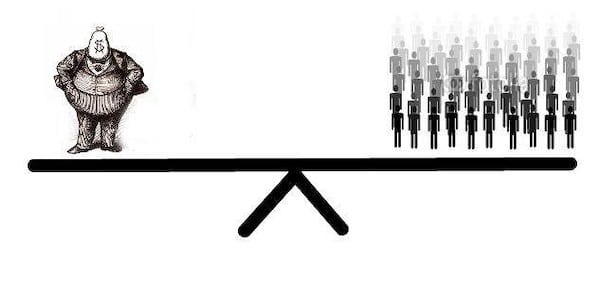
How should we measure inequality? There are two metrics that economists use: relative and absolute. In the past I have argued that the relative metric—which is by far the dominant approach, embodied in the standard Gini index, in the famous “elephant graph”, and in logarithmic distribution graphs—is problematic in that it is aligned with the interests and perspectives of the rich, and effectively obscures real inequalities in the distribution of new income around the world. From the perspective of justice, and indeed from the perspective of the poor themselves, what really matters is the absolute gap between rich and poor, not relative rates of change.
But there is another question that we need to consider here, about the relationship between income and power. One of the main reasons we are concerned about inequality in the first place is that it allows rich people to exercise power over the lives of the poor. In political terms, they can use it to lobby policymakers, fund political campaigns, buy media outlets, set up think tanks, or even outright bribe government officials. In economic terms, they can use it to, say, push wages down (by lobbying to restrict labour unions, for example), and push house prices up (because the excess income of rich people ends up flowing to assets).
So which metric gives us more traction in thinking about the power dimension of inequality? Relative or absolute?
Here’s a a case to consider. Imagine a poor person whose income is $5,000 and a rich person whose income is $100,000. Now imagine that the poor person’s income goes up by 100%, to $10,000, and the rich person’s goes up by “only” 50%, to $150,000.
The income of the poor person has grown at a faster rate (relative to their baseline) than the income of the rich person. As a result, while the rich person was initially 20x richer than the poor person, now they are only 15x richer. According to the relative metric, inequality has decreased.
According to the absolute metric, by contrast, inequality has exploded. The absolute gap between the rich person and poor person grew from $95,000 to $140,000. Put another way, of the total new income of $55,000, 91% of it went to the rich person. Only 9% went to the poor.
What about from the perspective of power differentials? Has inequality decreased or increased?
On the face of it, we might reason that a person who is 20x richer would have more power than a person who is only 15x richer, just as if they were 20x bigger or stronger versus only 15x. From this perspective, the reduction from 20x to 15x is an improvement, and the relative metric would be correct to suggest that inequality has decreased.
But someone might retort that this not how the income-power relationship works. Money buys power, so the more money you have the more power you can buy. One might even say that there is a one-to-one relationship between money and power: one more dollar gives you one more unit of power. From this perspective, the absolute metric would be correct to suggest that inequality has increased.
Neither of these approaches is adequate, however. Here’s why. When the poor person goes from $5,000 to $10,000, they are going to spend that new money on basic needs: rent, food, education, healthcare, etc. They will not have money left over to lobby policymakers or set up think tanks. For the rich person, by contrast, we can assume that virtually all of their new income is in excess to their needs, and therefore available to be spent on power.
So every additional dollar that goes to the rich adds to their (potential) political power, whereas the same additional dollar that goes to the poor does not—at least not if they are below a given need threshold.
This brings us to an interesting point. Economists justify their use of the relative inequality metric on the basis of “diminishing marginal utility.” Every additional dollar that goes to a rich person has less weight than an additional dollar that goes to a poor person, they say, because it means less to a rich person than it does to a poor person. And the richer the rich are, the less the new money means to them. This is why economists like to plot inequality on a logarithmic curve.
I have rejected this logic elsewhere, on its own terms. But from the perspective of power differentials it is even more wrongheaded. Indeed, the opposite is true. Every additional dollar that goes to the rich adds more to their power, and the richer they are, the more power it adds. Why? Because the more distant the new money is from any given need threshold, the more it is available to be spent on power. The relationship between income and power is, in effect, an inverse logarithmic relationship. Plus, we need to account for the fact that the more money the rich spend on power, the more they inflate its price, pushing power ever-further out of the reach of the poor.
In sum, the relative metric (i.e., the standard Gini index, the elephant graph, and logarithmic distribution graphs) is inappropriate not only from the perspective of poverty and justice, but also from the perspective of power. In fact, it gets the income-power relationship exactly backward. If we are to take the power dimension of inequality seriously, then we have to accept that the elephant graph beloved of the World Bank, and the log-humps graph beloved of Hans Rosling, are wildly misleading.
The absolute metric serves us better, but as it too falls short of capturing the real dynamics of the income-power relationship, we should recognize that inequality is likely to be worse than even the absolute metric implies. We can use the absolute metric as a rough proxy, but it is at best conservative.

