Most calls for a Green New Deal correctly emphasize that it must include a meaningful commitment to climate justice. That is because climate change—for reasons of racism and capitalist profit-making—disproportionately punishes frontline communities, especially communities of color and low-income.
A 2020 published study on redlining (“the historical practice of refusing home loans or insurance to whole neighborhoods based on a racially motivated perception of safety for investment”) and urban heat islands helps to shed light on the process. The authors of the study, Jeremy S. Hoffman, Vivek Shandas, and Nicholas Pendleton, examined temperature patterns in 108 U.S. urban areas and found that 94 percent of them displayed “consistent city-scale patterns of elevated land surface temperatures in formerly redlined areas relative to their non-redlined neighbors by as much as 7 degrees Celsius (or 13 degrees Fahrenheit).”
As one of the authors explained in an interview:
We found that those urban neighborhoods that were denied municipal services and support for home ownership during the mid-20th century now contain the hottest areas in almost every one of the 108 cities we studied,” Shandas said. “Our concern is that this systemic pattern suggests a woefully negligent planning system that hyper-privileged richer and whiter communities. As climate change brings hotter, more frequent and longer heat waves, the same historically underserved neighborhoods—often where lower-income households and communities of color still live—will, as a result, face the greatest impact.
Urban heat islands
Climate scientists have long been aware of the existence of urban heat islands, localized areas of excessive land surface heat. The urban heat island effect can cause temperatures to vary by as much as 10 degrees C within a single urban area. As heat extremes become more common, and last longer, the number of associated illnesses and even deaths can be expected to rise. Already, as Hoffman, Shandas, and Pendleton note,
extreme heat is the leading cause of summertime morbidity and has specific impacts on those communities with pre-existing health conditions (e.g., chronic obstructive pulmonary disease, asthma, cardiovascular disease, etc.), limited access to resources, and the elderly. Excess heat limits the human body’s ability to regulate its internal temperature, which can result in increased cases of heat cramps, heat exhaustion, and heatstroke and may exacerbate other nervous system, respiratory, cardiovascular, genitourinary, and diabetes-related conditions.
Studies have identified some clear causes for urban heat extremes—one is the density of impervious surface area; the greater the density, the hotter the land surface temperature. The other is the tree canopy; the greater the canopy, the cooler the land surface temperature. And as the three authors observe, “emerging research suggests that many of the hottest urban areas also tend to be inhabited by resource-limited residents and communities of color, underscoring the emerging lens of environmental justice as it relates to urban climate change and adaptation.” What their study helps us understand is that the process by which communities of color and poor came to live in areas with more impervious surface area and fewer green spaces was to a large degree the “result of racism and market forces.”
Racism and redlining
Racism in housing has a long history. Kale Williams, writing in the Oregonian newspaper, highlights the Portland, Oregon history:
Exclusionary covenants, legal clauses written into property deeds, prohibited people of certain races, specifically African Americans and people of Asian descent, from purchasing homes. In 1919, the Portland Realty Board adopted a rule declaring it unethical to sell a home in a white neighborhood to an African American or Chinese person. The rules stayed in place until 1956.
In 1924, Portland voters approved the city’s first zoning policies. More than a dozen upscale neighborhoods were zoned for single-family homes. The policy, pushed by homeowners under the guise of protecting their property values, kept apartment buildings and multi-family homes, housing options more attainable for low-income residents, in less-desirable areas.
Portland was no isolated case; racism shaped national housing policy as well. In 1933, Congress, as part of the New Deal, passed the Home Owners’ Loan Act, which established the Home Owners’ Loan Corporation (HOLC). The purpose of the HOLC was to help homeowners refinance mortgages currently in default to prevent foreclosure and, of course, reduce stress on the financial system. It did that by issuing bonds, using the funds to purchase housing loans from lenders, and then refinancing the original mortgages, offering homeowners easier terms.
Between 1935 and 1940, the HOLC drew residential “security” maps for 239 cities across the United States. These maps were made to access the long-term value of real estate now owned by the Federal Government and the health of the banking industry. They were based on input from local appraisers and neighborhood surveys, and neighborhood demographics.
As Hoffman, Shandas, and Pendleton describe, the HOLC:
created color-coded residential maps of 239 individual U.S. cities with populations over 40,000. HOLC maps distinguished neighborhoods that were considered “best” and “hazardous” for real estate investments (largely based on racial makeup), the latter of which was outlined in red, leading to the term “redlining.” These “Residential Security” maps reflect one of four categories ranging from “Best” (A, outlined in green), “Still Desirable” (B, outlined in blue), “Definitely Declining” (C, outlined in yellow), to “Hazardous” (D, outlined in red).
This identification of problem neighborhoods with the racial makeup of the neighborhood was no accident. And because the maps were widely distributed to other government bodies and private financial institutions, they served to guide private mortgage lending as well as government urban planning in the years that followed. Areas outlined in red were almost always majority African-American. And as a consequence of the rating system, those who lived in them had more difficulty getting home loans or upgrading their existing homes. Redlined neighborhoods were also targeted as prime locations for development of multi-unit buildings, industrial use, and freeway construction.
As expected, a 2019 paper by three researchers with the Chicago Federal Reserve Bank found:
a significant and persistent causal effect of the HOLC maps on the racial composition and housing development of urban neighborhoods. These patterns are consistent with the hypothesis that the maps led to reduced credit access and higher borrowing costs which, in turn, contributed to disinvestment in poor urban American neighborhoods with long-run repercussions.
What Hoffman, Shandas, and Pendleton establish in their paper is that this racially influenced mapping has also had real climate consequences. Urban heat islands are not just randomly distributed through an urban area—they are more often than not located in redlined areas. And those extra degrees of heat have real health and financial consequences. As Hoffman explains, the impact on residents of those heat islands is serious and wide-ranging:
They are not only experiencing hotter heat waves with their associated health risks but also potentially suffering from higher energy bills, limited access to green spaces that alleviate stress and limited economic mobility at the same time,” Hoffman said. “Our study is just the first step in identifying a roadmap toward equitable climate resilience by addressing these systemic patterns in our cities.
Redlining and climate change
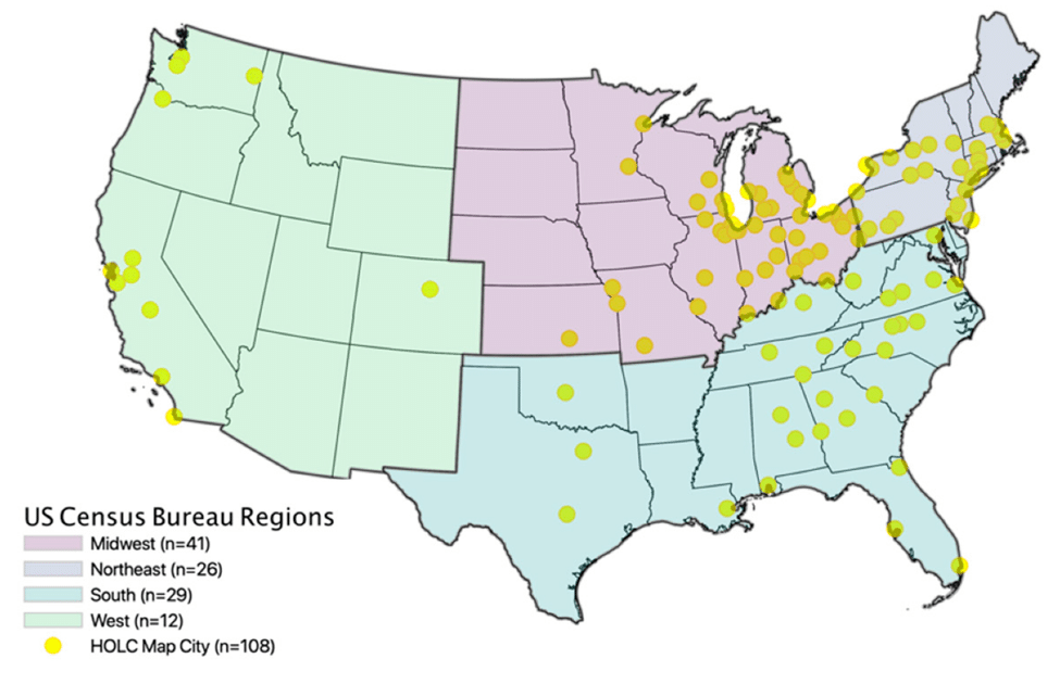
Hoffman, Shandas, and Pendleton condensed the 239 HOLC maps into a database of 108 U.S. cities. They excluded cities that were not mapped with all four HOLC security rating categories and in some cases had to remove overlapping security rating boundaries, or merge them because they were drawn in different years. The map below shows the location of the 108 cities.
They then used land surface temperature (LST) maps generated in summer months between 2014 and 2017 to estimate land surface temperatures in all four color-coded neighborhoods in each of these 108 cities to determine whether there was a relationship between LST and neighborhood rating in each city.
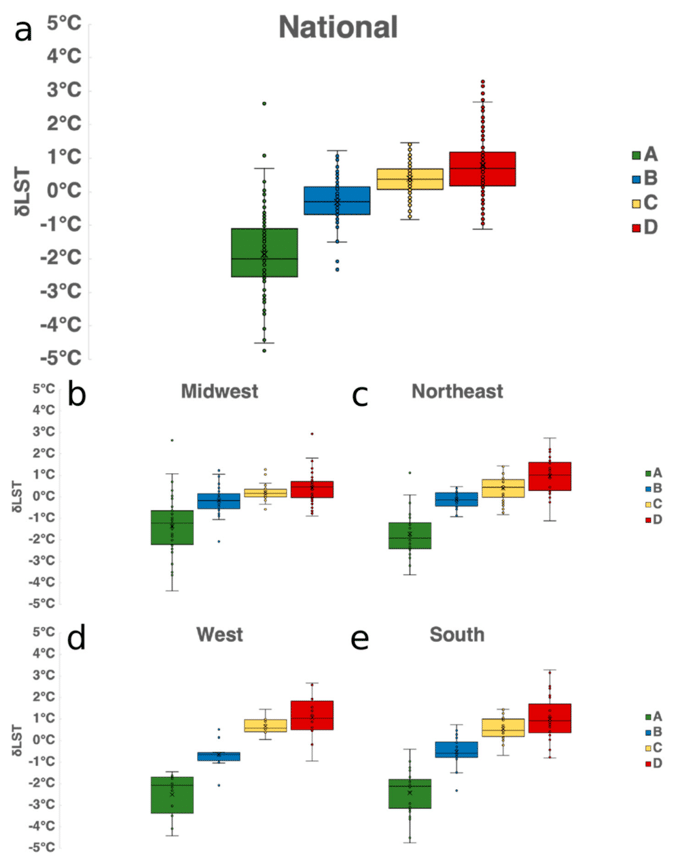
They found that present-day temperatures were noticeably higher in D-rated areas relative to A-rated areas in approximately 94 percent of the 108 cities. The results are illustrated below. Figure a shows the LST difference between ranked neighborhoods for the country as a whole. The four other figures do the same for each designated region of the country.
Portland, Oregon and Denver, Colorado had the greatest D to A temperature differences, with their D-rated areas some 7 degrees Celsius warmer than their A-rated areas (or some 13 degrees warmer in Fahrenheit). For the nation as a whole, D-rated areas are now on average 2.6 degrees Celsius warmer than A-rated areas. Thus, as the authors note, “current maps of intra-urban heat echo the legacy of past planning policies.” Moreover,
indicators of and/or higher intra-urban LSTs have been shown to correlate with higher summertime energy use, and excess mortality and morbidity. The fact that residents living in formerly redlined areas may face higher financial burdens due to higher energy and more frequent health bills further exacerbates the long-term and historical inequities of present and future climate change.
As this study so clearly shows, we are not all in the same boat when it comes to climate change; racial and class dimensions matter. The poor and people of color are disproportionately suffering the most from global warming largely because of the way racism and profit-making combined to shape urbanization in the United States. But this is only one example. A transformative Green New Deal must bring to light the ways in which this dynamic has shaped countless other processes and embrace and support the struggles of frontline communities, economic and climate.


