
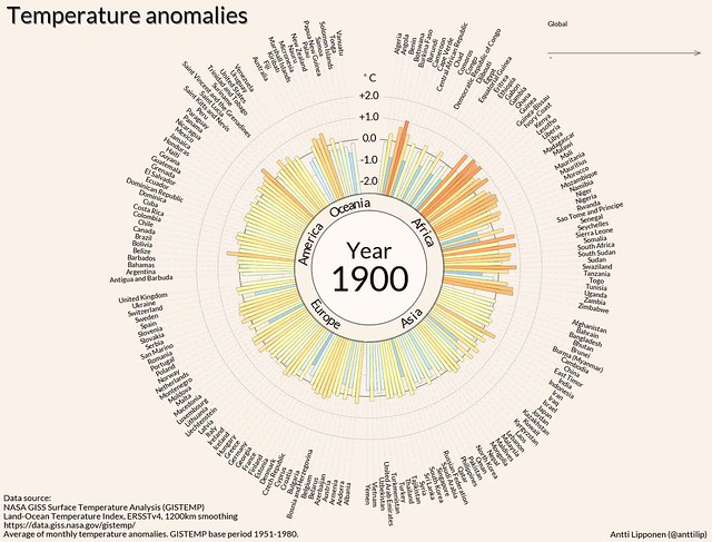
In just 35 seconds, a new video illustrates how drastically temperatures in each of the world’s 191 countries have changed over the last century.
Created by Antti Lipponen, a researcher at the Finnish Meteorological Institute, the video uses temperature anomaly data from NASA to show that despite year-to-year variations, communities across the globe are experiencing significantly warmer temperatures since the early 20th century, reported Vox.
The “broad trend is startlingly clear,” writes Vox. “It’s getting hotter all around the world.”
The video is the latest in a string of data-based graphics visualizing the increase of global temperatures and climate change for the general public. Last year, University of Reading climate scientist Ed Hawkins’ GIF showing global temperatures spiraling upward went viral and inspired a series of other climate GIFs. A graphic by The Nature Conservancy visualizing species’ movements in response to climate change was also widely shared last year.
Lipponen has shared his video using Flickr’s Creative Commons, which encourages people to copy, adapt, and build on the material.