Close your eyes and picture the end of the world. What do you see?
In 1570, cartographer Abraham Ortelius published the first modern atlas, charting a mostly unexplored world populated by a just a few hundred million humans. Almost 450 years and one industrial revolution later, a team of academics has responded to Ortelius’s Theatrum Orbis Terrarum with “Atlas for the End of the World.” The online project is a collection of 44 maps and dozens of data visualizations that soberly depict the bloody but often hidden conflicts between the planet’s growing population of humans and its increasingly threatened and limited biodiversity.
Contemporary artists from Olafur Eliasson to Julian Charrière have long made climate change the subject of their conceptually-charged work. But the “Atlas” is different. While an aesthetic object in its own right, the project—which was produced over the course of three years—is inherently fact- and research-driven, said its creator, Richard J. Weller, a professor of landscape architecture at the University of Pennsylvania.
“We were keenly aware for the need for things to be beautiful and well-crafted, but also legible,” Weller says. “The poetics are not lodged in each drawing, the poetics exist in the overarching project of the atlas.” As a piece of visual culture, the atlas “keeps a straight face,” as Weller puts it.

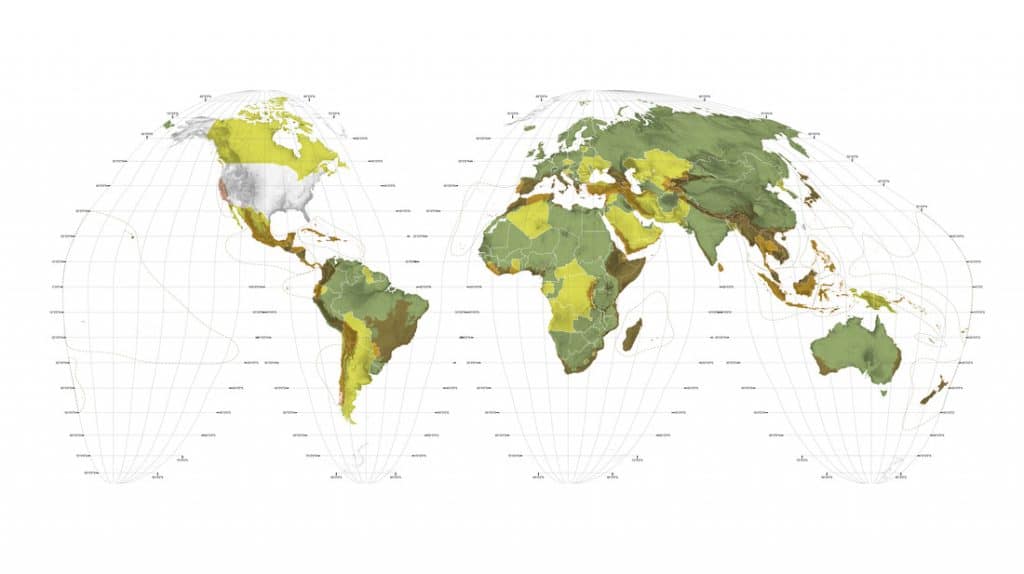
World Map Biodiversity, created by Richard Weller, Claire Hoch, and Chieh Huang. Image courtesy of the University of Pennsylvania. World Map Biodiversity. © 2017 Richard J. Weller, Claire Hoch, and Chieh Huang, Atlas for the End of the World.
Along with maps showing dire ecological data—threatened mammals and land degradation, for example—the atlas charts how some 422 cities are threatening some of the 36 areas where biodiversity, once rich, is now under threat. These locations have been designated “hotspots” by the global scientific community and, under targets agreed to by 196 countries, 17 percent of this and all land should be protected by 2020. Only about half the hotspots are on track to hit that goal, according to Weller’s analysis.
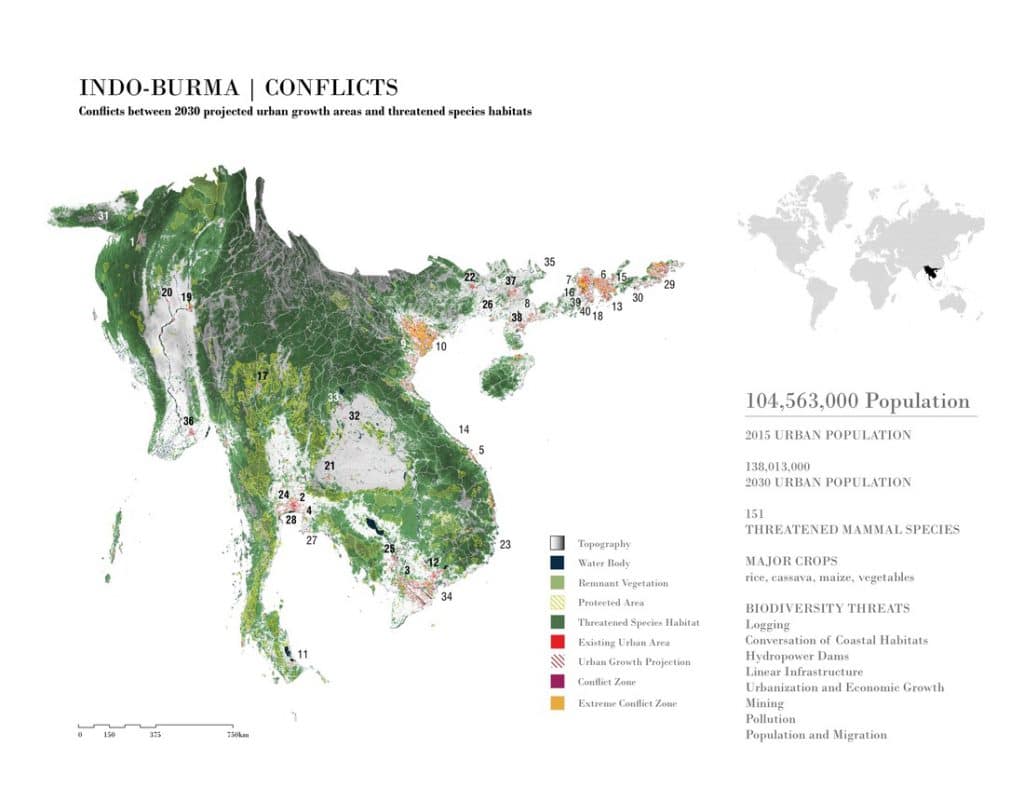
Also included in the atlas are “conflict maps,” showing places like the ever-expanding cities of Da Nang, Vietnam, and Dongguan, China, which are on a collision course with their surrounding natural landscapes.
“That conflict is bloody, it’s disastrous, it’s happening all over the world,” says Weller. “We mapped that interface between urban growth and the world’s most valuable diversity.”
“Atlas for the End of the World” might sound apocalyptic, but it’s not pointing to an inevitable End of Days. Rather, the project’s title refers to the end of the planet as it was when Ortelius mapped it—a place in which nature seemed to be an inexhaustible and unknown resource. And Weller’s initiative does share the common goal of all atlases across history: to open up the world by revealing it.

Indio-Burma Conflict Map. © 2017 Richard J. Weller, Claire Hoch, and Chieh Huang, Atlas for the End of the World.
Ultimately, this atlas is about hope. In mapping the intricacies of ecological conflict, Weller opens the possibility for potential intervention—this time by architects, designers, and others who can help create more ecologically sustainable relations between people and the planet, especially as urbanization continues and the majority of the world lives in cities.
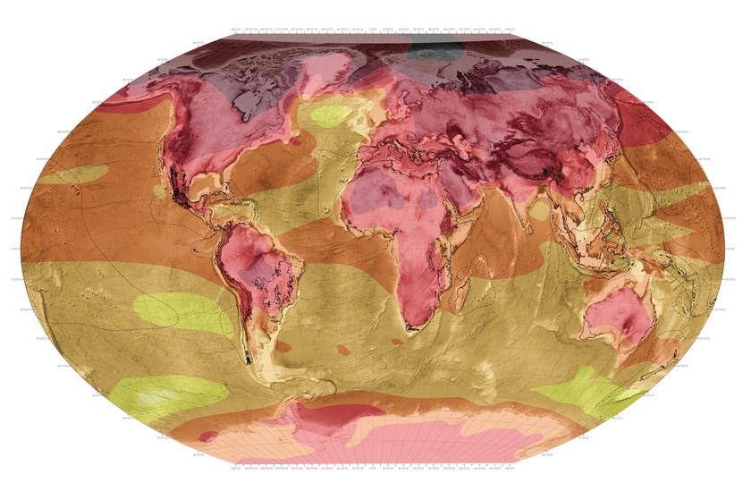
But the atlas, while optimistic, is also stark. Some of its most powerful images come in the form of datascapes. Using a technique popularized by Dutch architects, they take certain conditions to their extreme in order to make a point. To that end, these datascapes show the environmental toll of a population of 10 billion—the number expected to live on the planet in 2100—with each citizen enjoying the same comforts and amenities as the average American today.
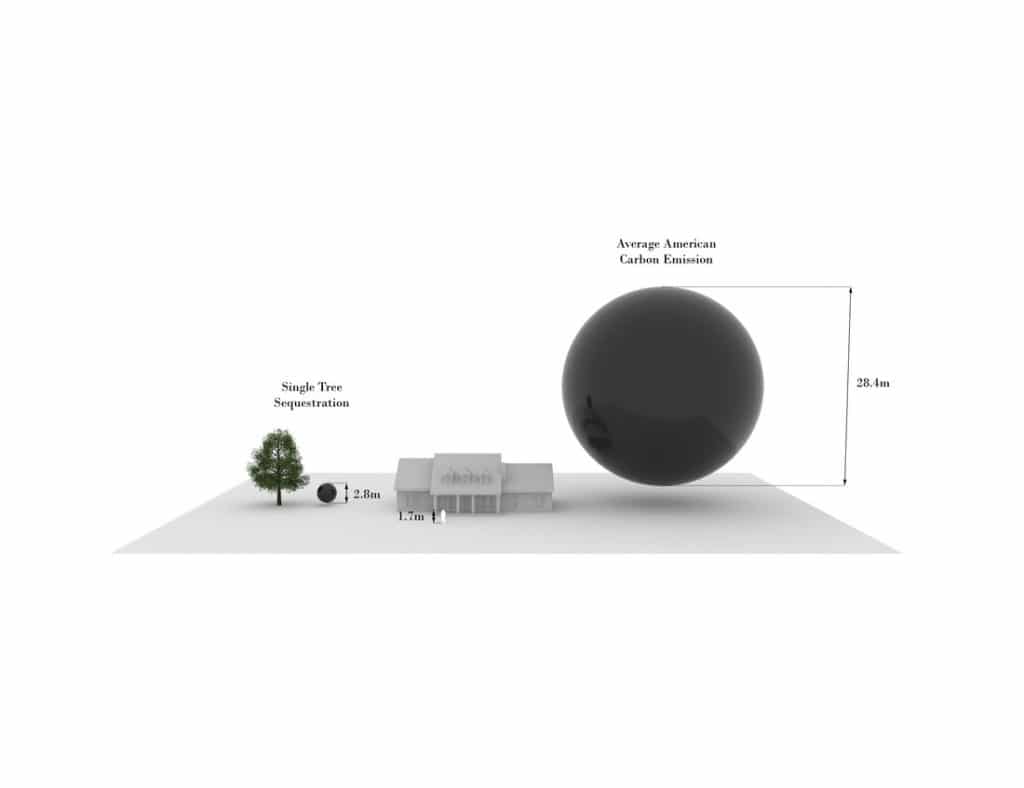
Along with the various structural impediments to solving man-made climate change—including the widespread denial of its existence by many in the United States, including its current President—there is the problem of visualizing the crisis itself. We can all picture “the end of the world” in the abstract, but we can’t easily picture the amount of carbon emissions which would bring it about.
The atlas’s datascapes help in that regard. One shows a orb representing the 21.55 metric tons of CO2 equivalents produced by the average American. The sphere looks like it’s about to roll over onto the American standing next to it (sized for scale). Another datascape shows how much land would be needed to feed a world of average Americans in 2100—roughly 93% of the earth’s ice-free terrestrial surface.
“The datascapes do not intend to be alarmist or pass moral judgment on high-consumption lifestyles,” notes the atlas. “What they do make clear, however, is that as large numbers of people aspire to higher material standards of living throughout the 21st century, our systems of production and consumption will need to be better designed and better tuned to the earth’s systems.”
The “Atlas for the End of the World” is also an atlas for the anthropocene—the era of geological time shaped by the existence of human beings. It has been a profoundly destructive period for those not lucky enough to be a wealthy member of our species. This week alone, a new study was released pointing to the rapid decline of endangered animal populations, and concluding that a sixth mass-extinction event is already underway.
“When [Ortelius’ atlas] was produced it was, in a sense, the beginning of modernity,” Weller said. The natural environment appeared endless. Today, “we’re cognizant of the fact that there is no future unless there is an ecological future.” That’s a reality one comes to see clearly after clicking through the digital pages of the “Atlas for the End of the World.”


