One of the most important stories I read, but did not write about, while I was away was the launch of the World Inequality Report 2018.*
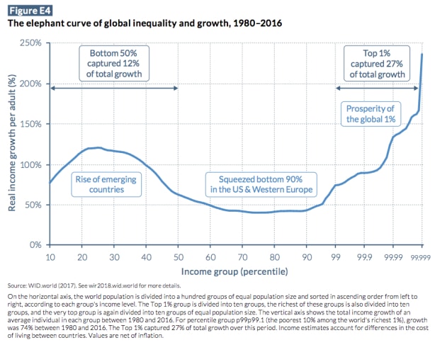
The authors of the report confirm what Branko Milanovic and others had previously discovered: that a representation of the unequal gains in world economic growth in recent decades looks like an elephant. Thus, the real incomes of the bottom 50 percent of the world’s population (except the poorest, at the very bottom) have increased, the incomes of those in the middle (especially the working-class in the United States and Western Europe) have decreased, and the global top 1 percent has captured an outsized portion of world economic growth since 1980.**
As I explained back in 2016, the “elephant curve” makes sense of some of the significant changes within global capitalism:
At one time (especially in the nineteenth century), [capitalist globalization] meant industrialization in the global north and deindustrialization in the mostly noncapitalist global south (which were, in turn, transformed into providers of raw materials, which became cheap commodity inputs into northern capitalist production). Later, especially after decolonization (following World War II), we saw the beginnings of capitalist development in the south (under the aegis of the state, with a set of policies we often refer to as import-substitution industrialization), which involved a reindustrialization of the south (producing consumer goods that were previously imported) and a change in the kinds of industry prevalent in the north (which both exported consumer goods to the rest of the world, which after the first Great Depression and world war were once again growing, and often provided inputs into the production of consumer goods elsewhere). Later (especially from the 1980s onward), with the accumulation of capital in India, China, Brazil, and elsewhere, noncapitalist economies were disrupted and millions of peasants and rural workers (and their children) were forced to have the freedom to sell their ability to work in urban factories and offices. As a result, their monetary incomes rose (which is not to say their conditions of life necessarily improved), which is reflected in the growing elephant-body of the global distribution of income.
But that’s not the real elephant in the world. The big issue that everyone is aware of, but nobody wants to talk about, is the obscene degree of economic inequality in the United States.

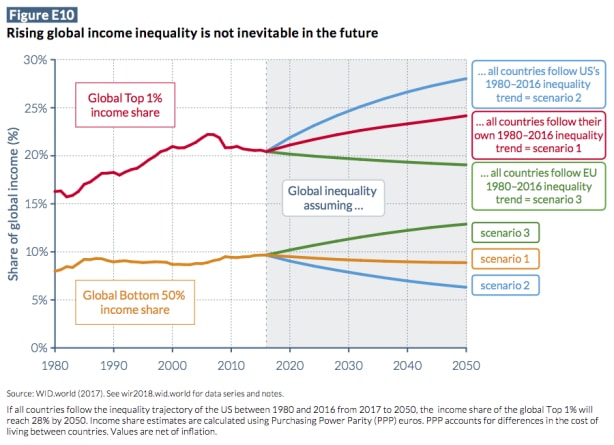
As it turns out, if the global distribution of income in the future followed the trajectory set by the United States, inequality would significantly increase. As is clear in the chart above, the share of income going to the top 1 percent would rise dramatically (from less than 21 percent today to close to 28 percent of global income by 2050) and that of the bottom 50 percent would fall off precipitously (from approximately 10 percent today to close to 6 percent).
The grotesque level of inequality in the United States—now and as it worsens looking forward, with stagnant wages and enormous tax cuts for large corporations and wealthy individuals—is the real elephant in the world.
*The World Inequality Report, created by the World Inequality Lab, is the latest in a series of major surveys of the world economy, which includes the World Bank’s World Development Report (beginning in 1978), the International Monetary Fund’s World Economic Outlook (beginning in 1980, first published annually, then biannually), and the United Nation’s Human Development Report (beginning in 1990). Each, of course, uses a different lens to make sense of what is going on in the world economy.
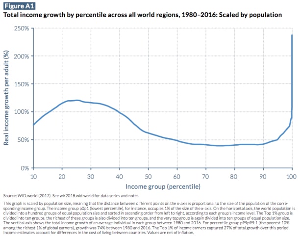
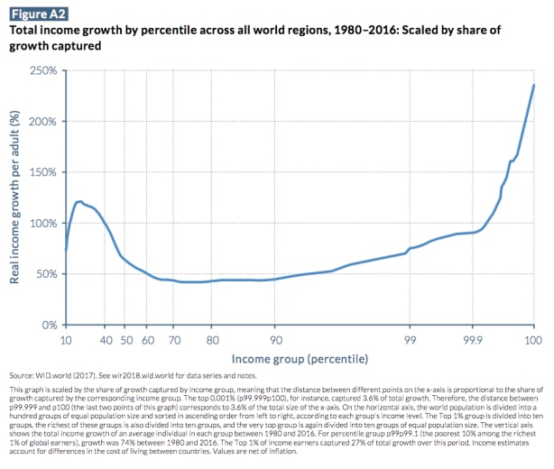
**The elephant curve combines two different scaling methods of the horizontal axis: one by population size (meaning that the distance between different points on the x-axis is proportional to the size of the population of the corresponding income group), the other by the share of growth captured by income group (such that the distance between different points on the x-axis is proportional to the share of growth captured by the corresponding income group), as in the charts below:


