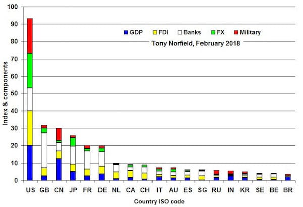
The following chart gives a snapshot of the top 20 countries, ranked by their index of power in the world economy. Readers of this blog or my book, The City, will have seen this concept before,1 but here the information is updated to 2016-17.

Notes: The height of each bar is given by the country’s total index value, which is then broken down into the respective components. Countries are identified by their two-letter ISO code. Take care, because CH is Switzerland, not China (which is CN) and DE is Germany.
The overall picture shows a small number of countries, led by the U.S., towering over the rest. Only 33 countries out of 180 have an index that is more than 1% of the U.S. index number! In the chart, the columns for these would look like the x-axis, so I have shown just the top 20 countries. Of those, only five are close to or above 20% of the U.S. number: the UK, China, Japan, France and Germany.
The UK remains number 2 on these updated figures. But its index value has slipped back in the past few years on most measures, and likely will slip further in future with the impact of Brexit. China stays number 3, but has come in closer, helped by its GDP growth, a greater use of its currency in world markets and by the size of its foreign direct investment assets (FDI).2 France has edged a little above Germany in the latest ranking, helped by the better relative position of banks in France.
I have excluded from the chart several countries whose ranking is boosted artificially, namely in ways that do not reflect its power. For example, in the latest data the Cayman Islands stood out as an international banking centre and a home of foreign direct investment. But the banks and the assets have little to do with citizens of the Caymans. Ireland and the British Virgin Islands are excluded for similar reasons relating to FDI.
Statistical details
Roughly 180 countries have been taken into account for this ranking. Depending on the statistical measure used, data are available only for 40 to 150 or so.
My five measures are:
- Nominal GDP (2017 estimates, IMF)
- Foreign Direct Investment stock outstanding (at end-2016, UNCTAD)
- Outstanding cross-border lending and borrowing by banks (September 2017, BIS)
- The use of a country’s currency in international markets (April 2016, BIS)
- A country’s military expenditure (2016, SIPRI)
If a country is top in all categories, e.g. it has the biggest GDP, the biggest military spending, and so forth, then it would have an index number of 100.0. If another country had a GDP half the size of the biggest one, then its number on this measure would be 50; if its FDI were only one-quarter of the biggest country (not necessarily the same country), then its number would be 25; if it had the biggest international bank lending and borrowing, then its number would be 100. Taking each of its five individual measures and dividing by 5 would give the final index number for that country’s power rank. The measures have equal weights.
So what?
The idea behind this chart is to present key features of the world economy in a summary way. At the very least, it gives the lie to the absurd notion that there is an ‘international community’ and instead makes one focus on global power relationships. Each of the measures has limitations, discussed elsewhere, as is true for any set of data. But the evolution of the chart is also useful for tracking how the relative strengths of the major powers change over time.
[1] See here for one of the early versions, and Chapter 5, ‘The World Hierarchy’, of The City: London and the Global Power of Finance, Verso 2016 and 2017, for a fuller explanation.
[2] Data for Hong Kong and China should be combined, since they are one country. However, there are difficulties. For example, this can easily be done for GDP, but in the case of FDI, most of Hong Kong’s is in China. So I have included only China’s FDI (most of which I believe is outside Hong Kong). In the China data shown, I have added Hong Kong only for GDP and FX. Banking is taken as the average of the two; FDI and military spending is China only. The resulting index number will probably slightly understate China’s importance.
